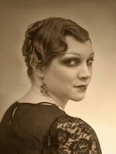
"Better Than Her Bite"
7"x 5" colored pencil, gel pens and gouache on board.
Terrible Photograph. Blurring and a little Flat.
good enough for some blog-age.
So. I've been drawing mouth hats for... well over a year now, and I love them, however I love them very stylized and graphic in my sketch books, and that esthetic has been the rock to my realistic renderings hard place. Did that make sense? I have been sitting on my hands trying to figure out how to marry the two, and been a totally chicken about it. Until now. This is the first study, I just went for it, and I'm fairly happy. I didn't allow myself to think about it much at all for fear of once again over thinking, and just dove in the with a model I liked from the 40's (thank you flickr commons) and some ink. It's very bright and carnival. I want to play with harmonizing the mediums a bit more, and get a little darker and bring the hats a bit more into the third dimension. So, now that I've taken the weight of doing it once off my shoulders, doing it again and again seems... no longer daunting, but exciting.

3 comments:
I have experienced that some times it's just about getting in there. Once you get started the ideas flow. When I tend to hit snags, problem solving tends to take me in a new direction that I hadn't totally planned, but works better. Most of the creative process is creativity through problem solving.
Your grasp of color harmony is outstanding. Kudos!
Cool blog as for me. I'd like to read more about that theme. Thanks for giving this material.
Joan Stepsen
Hi tech pharma
It's a great idea ... do the top teeth ever rest on her head?
Post a Comment